Minimalism website design is a current trend. From interior design to industrial design, minimalism is often associated with the birth of Modernism in the 1940’s and became very popular in the 1960’s.
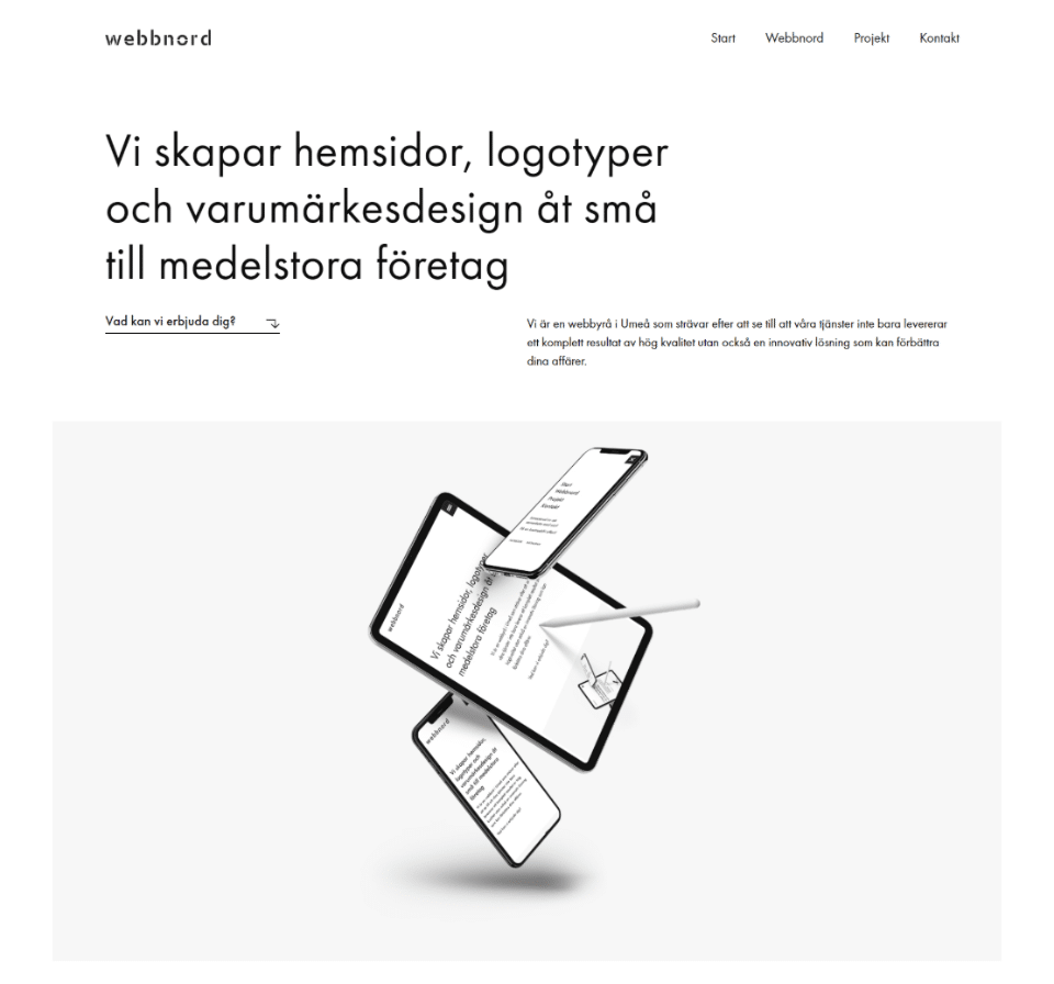
Minimalist website design is all about designs that are distilled down to their most basic essentials. As such, they serve to make the content perfectly clear and consumable for the viewer. The Swedish company, Webbnord, demonstrates the concept well on their site (not my design):

Minimalist website designs lend themselves well to most any project. This design helps call attention to products on an ecommerce site, to simple feature statements and makes a strong brand statement just in the design alone.
But I like color! I hear that often when discussing the possibility of a minimalist design with a client. I like color too and color definitely plays a key role in minimalist design. Typically a maximum of 2-3 colors and often in a pastel palette. However, as long as the use of color supports the concepts of a minimalist design, then it is welcome.
Like the famous quote from Samuel Clemens, “If I had more time, I would have written a shorter letter,” minimalist designs take more planning up-front in their execution. User interface, color palette, text styles all play a role and need that extra planning effort up front.
I love working on minimalist designs, so if your story really needs to stand out online, then a minimalist design could be the answer. Get in touch and let’s discuss how to shine a light on you with a minimalist design.
Photo courtesy of David Van Dijk on Unsplash

